
ABOUT
Converting files and changing their names is usually a time-consuming task. Therefore, I wanted to create an app that is easy and straightforward to use. Many existing apps have complicated selection menus or lack essential functions. This app's design ensures that anyone, even with basic knowledge, can convert files effortlessly.
ROLE
UI Design
ui
Work FLOW

Color palette
When it came to designing the logo, I wanted to create something simple yet efficient, making the use of the app even easier. I chose a minimalistic design featuring a file icon with the title at the bottom, making the logo recognizable and easy to find. The name "File Evolve" was selected because the concept behind the app is not only about renaming files but also about transforming them into different types, evolving them to suit your needs.

Logo
When it came to designing the logo, I wanted to create something simple yet efficient, making the use of the app even easier. I chose a minimalistic design featuring a file icon with the title at the bottom, making the logo recognizable and easy to find. The name "File Evolve" was selected because the concept behind the app is not only about renaming files but also about transforming them into different types, evolving them to suit your needs.

FINAL
All Variants
Font
The font choice was inspired by the one used in macOS, as I wanted the app to have a seamless and familiar look for Mac users. By using a typeface that is consistent with Apple's design language, the app feels more integrated and compatible with Mac devices.

Body- 10.4pt
Screens

Screens
I wanted to ensure that each screen maintains a consistent and user-friendly design. Once the images are uploaded into the Dropbox, users are given the option to adjust the files in bulk, allowing them to make changes quickly and efficiently.


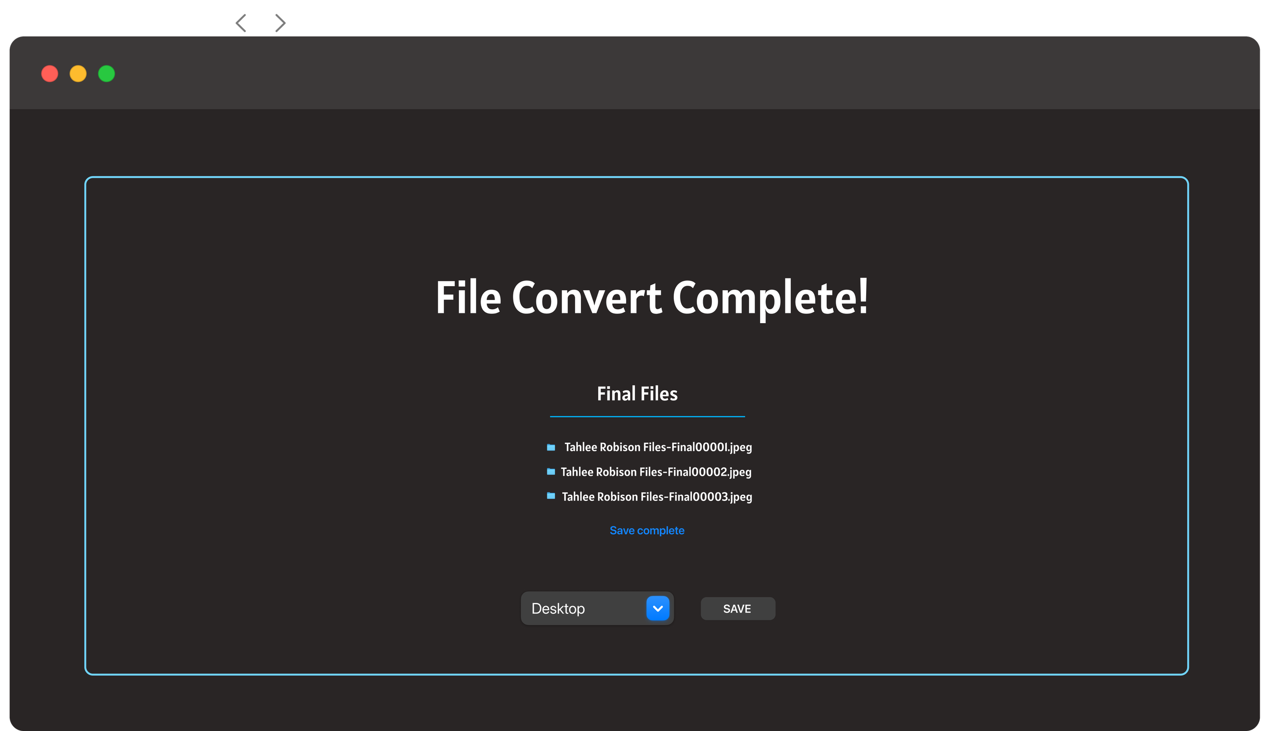
Selected items
To ensure a smooth and intuitive experience for the user, I implemented a light blue color to highlight items that are being edited or are currently in use. This subtle yet effective visual cue helps guide the user through the app, making it clear which elements are active or require attention.


Buttons
The buttons are the most critical element of this app because they serve as the primary point of interaction. If users can't easily understand what to tap or what action to take, the entire user experience falls apart. With this in mind, I prioritized simplicity in the button design, ensuring they are clear and intuitive.
Drop downDrop down


toggle

Submit button


Conclusion
Through my exploration of creating a tool that simplifies file renaming and converting, I’ve realized just how crucial the user experience is. As a designer, I can make all the technical decisions and focus on the functionality, but the most important question is: Would someone who’s not a graphic designer understand how to use this? After reflecting on this, my answer is a resounding YES! I believe the design is intuitive and accessible, ensuring that anyone, regardless of their technical background, can easily navigate the app and accomplish their tasks without frustration. Ultimately, the success of this tool lies in its ability to make complex tasks feel simple and effortless for all users.